A landing page is a standalone web page created specifically for a marketing or advertising campaign. It’s where a visitor “lands” after they click on a link in an email, or ads from Google, Bing, YouTube, Facebook, Instagram, Twitter, or similar places on the web. Unlike regular web pages, which typically have many goals and encourage exploration, landing pages are designed with a single focus or goal, known as a call to action (CTA). This simplicity helps to guide users toward your intended conversion goal. Landing pages are essential for any digital marketing campaign because they provide a targeted platform tailored to meet the campaign’s specific objectives, which could range from collecting email addresses to selling a product.
Why is a Landing Page Important?
Landing pages are critical in affiliate marketing because they increase the chances of converting traffic from your digital campaigns into actual customers. By directing users to a page that matches the advertisement’s promise, you enhance user experience by providing them with the information or services they were expecting. This relevance helps in significantly reducing the bounce rate—the percentage of visitors who leave the site after viewing only one page. Moreover, well-designed landing pages can effectively capture lead data, such as email addresses, through forms. Having this data allows you to nurture leads through email marketing or other strategies, increasing the likelihood of turning those leads into sales. Overall, landing pages are indispensable tools for improving the effectiveness of your digital marketing strategy, ensuring that potential customers are not lost and are instead encouraged to take action.
How to Create a Landing Page?
Creating a landing page can significantly boost your marketing efforts by providing a targeted platform for converting visitors into leads or customers. Here’s a step-by-step guide on how to create an effective landing page:
1. Define Your Goal
Before you start designing your landing page, you need to have a clear understanding of its purpose. Identify the primary action you want visitors to take—whether it’s subscribing to a newsletter, registering for a webinar, or purchasing a product. This goal should guide every aspect of your landing page design and content, ensuring that all elements are aligned to encourage visitors to take that specific action. Having a well-defined goal helps streamline your focus, making it easier to measure the success of the page and optimize it for higher conversion rates.
2. Choose a Landing Page Builder
Selecting the right landing page builder is crucial as it affects the ease of creation and the quality of your final page. Consider builders like Leadpages, Unbounce, or Wix, which are known for user-friendly interfaces and robust features. These platforms offer a variety of templates and tools that can accommodate both beginners and experienced designers. Look for features such as drag-and-drop editors, customizable templates, and integrations with other marketing tools. The choice of builder will depend on your budget, design skills, and specific needs like A/B testing capabilities or advanced analytics.
3. Pick a Template
Once you’ve chosen a landing page builder, the next step is to select a template that suits your campaign’s objective. Most builders offer a range of templates designed for different actions, such as lead generation, sales, or event registration. Pick a template that visually aligns with your brand and the message you want to convey. An effective template not only looks good but also comes with a functional layout that guides visitors towards your conversion goal, minimizing distractions and focusing on the key message and call to action.
4. Craft Compelling Content
The content on your landing page should be engaging and direct, clearly explaining the value of what you’re offering. Start with a powerful headline that captures attention and communicates the core benefit of your offer. Follow this with a persuasive body copy that elaborates on the benefits, addressing any potential objections that a visitor might have. Your call to action (CTA) should be compelling and clearly state what visitors will get by completing the action, such as “Download Free E-book” or “Register Now to Save Your Spot.” Use concise, action-oriented language that motivates visitors to take immediate action.
5. Optimize for SEO
Optimizing your landing page for search engines is a vital step to increase visibility and attract more organic traffic. Use relevant keywords throughout your content, including the title, meta description, headers, and body text. However, it’s important to balance keyword use with natural readability to ensure your content remains user-friendly. SEO efforts should also include optimizing images with alt text and ensuring fast page loading times, as these factors contribute to better search engine rankings. Remember, the goal is to attract the right audience to your page through effective search engine practices.
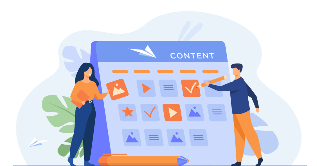
6. Add Visual Elements
Visuals play a crucial role in the effectiveness of your landing page by capturing attention and conveying messages quickly. Choose images, videos, or graphics that are directly relevant to your offer and enhance your message. High-quality visuals can increase engagement and help visitors understand the benefits of your offer at a glance. For instance, if your page is promoting a product, include clear, enticing images or a short video demonstrating the product in action. Ensure that visuals are strategically placed to support the content without overwhelming it, and always optimize file sizes to maintain fast loading times.
7. Integrate Forms
Forms are essential for capturing visitor information, turning anonymous visitors into leads. Keep your form design simple and only ask for essential information, like name and email, to maximize completion rates. Place the form prominently on the page but ensure it doesn’t disrupt the user’s journey. To encourage form submission, consider adding a value proposition, such as a free download or a discount code upon submission. Make sure the submit button stands out and its message aligns with your overall goal, like “Get Your Free Guide” or “Join the Webinar.”
8. Ensure Mobile Responsiveness
With more than half of web traffic coming from mobile devices, your landing page must perform flawlessly on smartphones and tablets. A mobile-responsive design adjusts to fit the screen size and orientation of the device it’s viewed on, providing an optimal user experience. Check that all elements like text, images, and forms are easily viewable and usable on mobile. Use a mobile-first design approach if possible, as it prioritizes the mobile experience and often leads to better performance across all devices.
9. Test and Optimize
Before launching your landing page, conduct thorough testing to ensure everything works as expected. This includes checking compatibility across different browsers and devices, verifying links and forms function correctly, and proofreading content for errors. After launch, use A/B testing to compare different versions of your page elements, such as headlines, images, and CTAs. This allows you to continually refine and optimize the page based on actual user data and improve conversion rates over time. Regular testing and updates keep the landing page effective and relevant.
10. Analyze Performance
Monitoring the performance of your landing page is key to understanding its effectiveness and identifying areas for improvement. Utilize web analytics tools to track metrics such as visitor numbers, conversion rates, bounce rates, and user behavior on the page. These insights can help you gauge whether the landing page meets its goals and how users interact with the content. Based on this data, make informed decisions to tweak and enhance the page. Regular analysis helps maintain a high-performing landing page that continuously meets user needs and business objectives.
Tips to create the best landing page
Creating an effective landing page involves a mix of design, content, and strategy. Here are some practical tips to help you create a landing page that converts visitors into customers or leads:
- Clear and Concise Headline: Your headline is the first thing visitors will see, so make it count. It should be compelling and clear, directly stating what the visitor will gain from your page. Keep it concise but powerful enough to grab attention and draw readers into the rest of the content.
- Compelling Copy: The text on your landing page should be focused and persuasive. Use concise language that communicates the value of what you’re offering quickly and effectively. Highlight the benefits, not just the features, of your product or service to help visitors understand how it solves their problems or improves their situation.
- Strong Call-to-Action (CTA): Your CTA is critical—it’s what you want your visitors to do on your landing page. Make your CTA button text specific and action-oriented, like “Start Your Free Trial” or “Download Now.” Place the CTA in a prominent position on your page and use contrasting colors to make it stand out.
- Optimize for Speed: Page load time is crucial for keeping visitors engaged. Ensure your landing page loads quickly by optimizing images, minimizing code, and using fast hosting services. A faster page can improve the user experience and increase your conversion rate.
- Use High-Quality Visuals: Images and videos can help increase engagement and convey your message faster than text alone. Use high-quality graphics that are relevant to your offer and align with your brand. Visuals should complement your copy and not distract from your main message.
- Keep Forms Simple: If your landing page includes a form, keep it as simple as possible. Ask for only the essential information you need from visitors, such as email and name, to maximize form completion rates. Lengthy forms can deter visitors from completing them, reducing your conversions.
- Ensure Mobile Responsiveness: With an increasing number of users accessing the web via mobile devices, your landing page must look good and function well on all screen sizes. Mobile responsiveness ensures that your page adjusts to fit the device it’s being viewed on, providing a good user experience for all visitors.
- Test and Tweak: Use A/B testing to try different versions of your landing page components, such as headlines, images, and CTAs, to see what works best. Continuous testing and tweaking based on data and user feedback can significantly improve the effectiveness of your landing page.
- Social Proof: Include elements of social proof like testimonials, customer reviews, and trust badges to build credibility and trust with your visitors. Seeing positive feedback from other customers can significantly influence the decision-making process of potential new customers.
- Keep It Focused: Remove any navigation links that could take visitors away from your landing page. Keep the design clean and the content focused on a single message, with one primary call to action. This minimizes distractions and keeps visitors focused on your conversion goal.
Five mistakes to avoid with landing pages
Creating a successful landing page involves more than just good design and compelling content; it also requires careful planning and execution to avoid common pitfalls. Here are five mistakes to avoid when designing your landing page:
- Overwhelming Visitors with Information
Keep your landing page focused and concise. Overloading it with too much information can confuse visitors and dilute your main message. Stick to one clear offer and keep the text to the point. A cluttered page makes it difficult for visitors to understand what action you want them to take, which can lead to higher bounce rates.
- Weak or Unclear Call-to-Action (CTA)
Your CTA is vital for conversions. A common mistake is having a CTA that is vague, non-specific, or hard to find. Ensure that your CTA is bold, clear, and compelling. Use action-oriented language that tells visitors exactly what they will get by clicking, such as “Download Your Free Guide” or “Get Started Today.” Place the CTA prominently on the page, ideally above the fold where it can be seen without scrolling.
- Ignoring Mobile Users
Failing to optimize your landing page for mobile devices is a significant oversight. A large portion of web traffic comes from mobile devices, so it’s essential that your landing page displays correctly and loads quickly on all screen sizes. Ensure that buttons are large enough to tap, content is easily readable, and navigation is simple on mobile devices.
- Lack of Trust Signals
Trust signals, such as testimonials, customer logos, certifications, and guarantees, are crucial for building credibility. Not including these elements can make your landing page seem less legitimate or trustworthy. Incorporate trust signals that are relevant to your offer to reassure visitors and help convince them to take the desired action.
- Not Testing and Optimizing
One of the biggest mistakes you can make is to set up a landing page and then neglect to test and refine it. Continuous testing (A/B testing) and optimization based on real user data are crucial for improving conversion rates. Test different elements like headlines, images, CTAs, and overall layout to find what resonates best with your audience and leads to the highest conversions.
An Example of a Good Landing Page
A good example of an effective landing page comes from Dropbox Business. Here’s a breakdown of why it stands out as a well-constructed landing page:
- Clear and Compelling Headline
Dropbox Business uses a clear, direct headline that addresses a common need or pain point: “More than secure storage, it’s a smart workspace.” This headline effectively communicates the core benefit of the service, positioning Dropbox not just as a storage solution but as a tool that enhances productivity and collaboration.
- Concise Subheadline
The subheadline supports the main headline by expanding on the idea: “Dropbox helps your team stay organized and keeps your work secure.” This further clarifies the benefits and the value proposition, reinforcing the message that Dropbox Business is more than just storage—it’s a comprehensive workspace solution.
- Strong Visuals
The landing page features clean, appealing visuals that depict diverse teams using the service in various work environments. These visuals are not only high quality but also relevant, as they show the product in use, helping potential customers visualize themselves using the platform.
- Focused Call-to-Action (CTA)
The CTA is prominently displayed and straightforward: “Try free for 30 days.” It’s a low-risk, high-reward offer that encourages users to experience the service without a long-term commitment. The CTA button stands out with a contrasting color that draws attention.
- Minimal Form Fields
The form on the landing page is simple and not overly intrusive, asking only for essential information to get started. This simplicity helps to increase the likelihood of conversion, as potential customers are more likely to sign up if the process does not require too much effort or personal information upfront.
- Mobile Optimization
The Dropbox Business landing page is fully optimized for mobile devices, ensuring a seamless experience whether viewed on a desktop or a smartphone. This is crucial, as a significant portion of users access the internet via mobile.
- Trust Signals
Dropbox includes several trust signals on its landing page, such as customer testimonials, logos of well-known companies that use their service, and security certifications. These elements build credibility and reassure potential customers of the quality and reliability of their service.
FAQs
1. What makes a headline effective on a landing page?
An effective headline is clear, concise, and directly addresses a benefit or solution that resonates with the target audience.
2. How important are visuals on a landing page?
Visuals are crucial as they help quickly convey the message and benefits, enhance the page’s aesthetic appeal, and can improve user engagement.
3. What should be included in a call-to-action?
A call-to-action should include direct, action-oriented language that clearly states what the visitor will receive or achieve by clicking, such as “Download Now” or “Start Your Free Trial.”
4. Why is mobile optimization important for landing pages?
Mobile optimization is essential because a significant portion of web traffic comes from mobile devices, and a well-optimized page ensures a good user experience across all devices.
5. How can trust signals improve a landing page?
Trust signals such as testimonials, security badges, and client logos help build credibility and reassure visitors of the product’s reliability and the company’s integrity.
6. What is the benefit of keeping form fields to a minimum?
Minimizing form fields can reduce user friction and increase the likelihood of conversion, as visitors are more willing to complete shorter forms that require less personal information.